Brand identity
Marble. Space. Distortion.
How RAMM4EVER looks and sounds. Everything a partner, designer or journalist needs to use our brand the right way.
// Logo
The mark
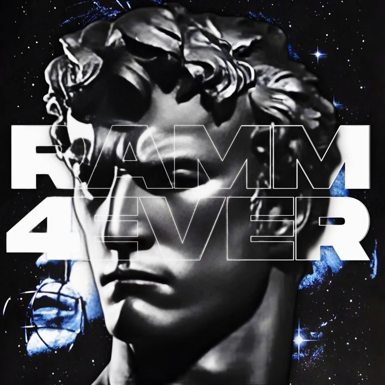
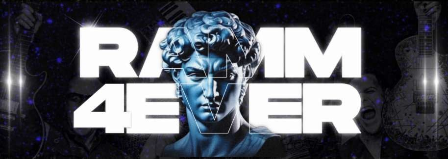
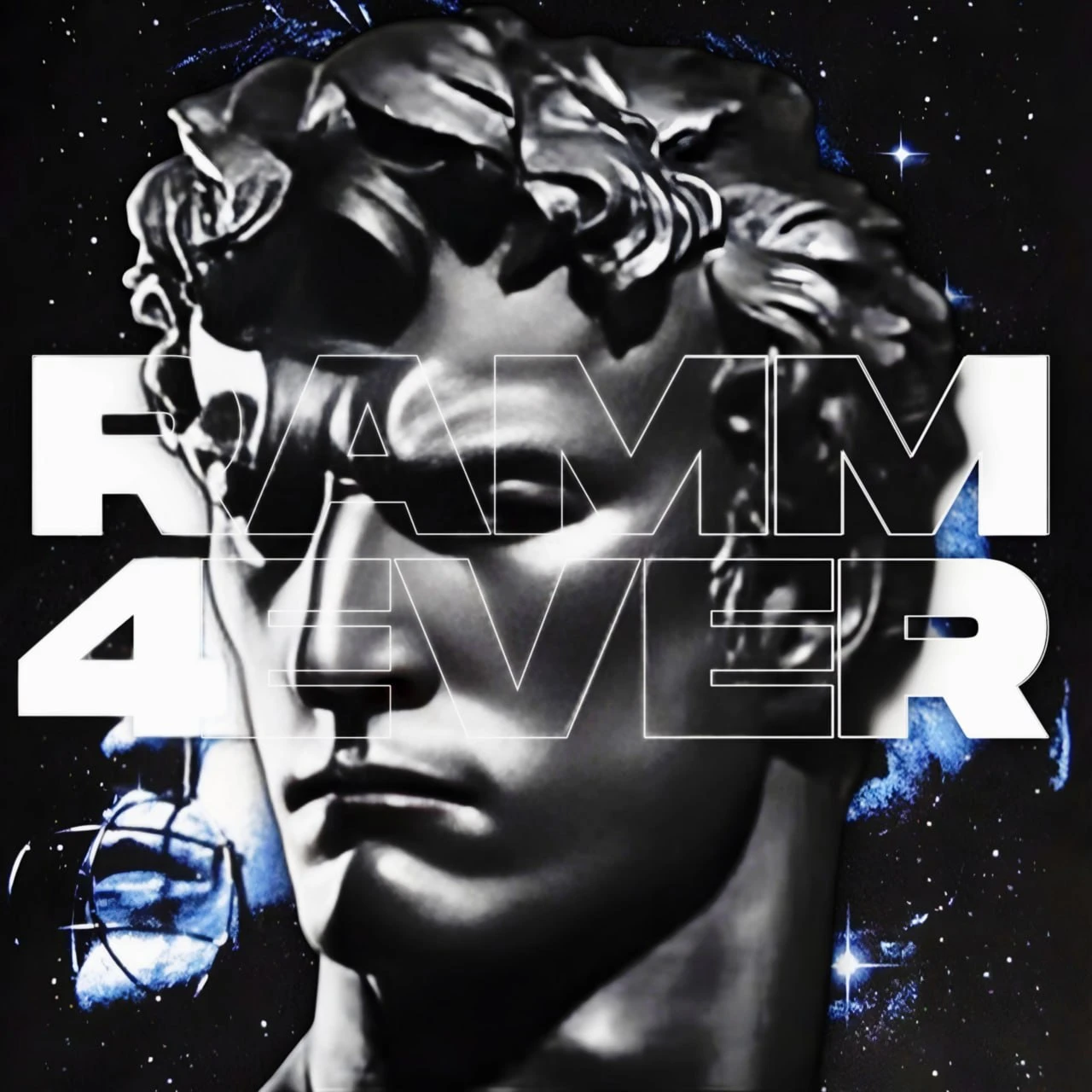
Our main logo is the marble statue in space with RAMM 4EVER stacked across it. The letters behind the face are solid and the ones over it are outlined. When space is tight, use the one-line wordmark.
- Leave some space around the wordmark, at least as much as the height of the “4”.
- Use white on dark backgrounds and black on light ones.
- Don't recolour, stretch or rotate the logo, and don't add effects to it.
- Don't put the logo on busy photos without darkening them first.
// Colour
Void & electric blue
Click a colour to copy its HEX code.
// Type
Wide, heavy, loud
Aa RAMM4EVER
Archivo Expanded Black
Headlines and the logo, always in capitals
Aa RAMM4EVER
Archivo
Body text
Aa RAMM4EVER
JetBrains Mono
Labels, numbers and tape tags
All fonts are free on Google Fonts. Headlines are in capitals with tight line spacing, and outlined words add emphasis.
// Visual language
Statues, stars, steel
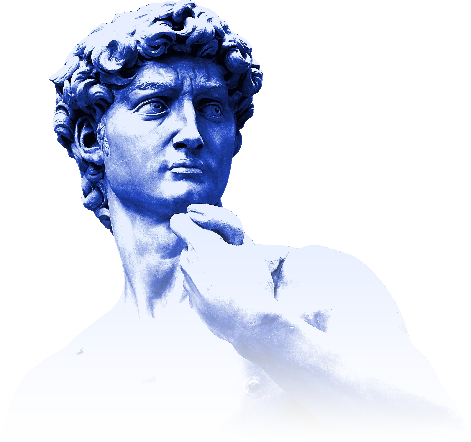
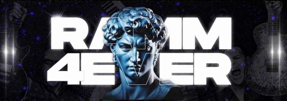
- ImageryMarble statues, starfields and blue light from distant nebulas.
- TypeWide, heavy capitals mixed with outlined words, just like the logo.
- DetailsTape labels, typewriter numbers, film grain and a little colour glitch.
// Voice
How we talk
Loud, never nasty
We have strong opinions about music and real respect for the people who make it.
Story first
Every edit has a story worth telling in one breath.
Fan to fan
We talk like the person next to you in the pit, not like a press release.
// Downloads